
Wednesday, 30 November 2011

Wednesday, 23 November 2011
Jump-Cut Section of Music Video
This is a video of me explaining the set up of the jump cut scene in the middle of my music video.
Tuesday, 22 November 2011
Editing
So far I've nearly completed my video, apart from two sections which I need to re-film due to them not turning out the way I expected.
Problem 1
The first problem was that I filmed a clock for hours, whilst it was stuck to my conservatory window as the background faded to the evening. However this didn't work as planned when I uploaded it onto the iMac, as iMovie's features of speeding up footage only goes up to 2000% which was no where near fast enough for what I had wanted.
Solution 1
To overcome this I've decided to change the shot slightly, I'm going to re-film the clock against the window for a couple of hours, but then super impose this onto another shot. The other shot will have the camera in exactly the same place, but I'm going to get my actor to stand in various places behind the window in the background, and jump cut it quickly to the beat. This will allow the clock to be sped up whilst Kieran is jump cutting in the background but in real time.
Problem 2
The other problem I had was filming the spinning aerial shot to end the video. I attempted it by taping string around my camera and gently spinning it, but this meant that I had no control as to what it was showing as it was swinging all over the place. Because I was holding the string it also had a handheld effect which I didn't want.
Solution 2
I'm going to re-film this, using a lighting pole which has a hole that I can feed the string through, and therefore enhance the control. It should also keep it more balanced and make it not look as handheld, giving it a smoother finish, making it much more suitable for the last shot of my video as the song fades out.
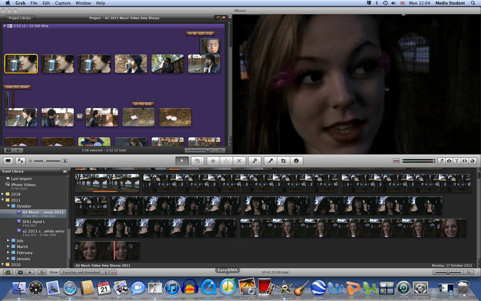
Annotations using iMovie
Here are screen shots of the annotations I made as I edited my video, to make sure I remembered any ideas or opinions that I had about separate frames. This helped me when I came back to edit another time to make sure that I didn't forget anything that I had thought of the last time I was editing.


Monday, 21 November 2011
Editing
Whilst editing my music video, I realised that some of the last shots that I filmed are quite low quality because of the low lighting. I've decided to take this out, and use other footage that I had left over from other shots as I made sure that I filmed a lot more than I needed.
Here's a picture of a range of these shots:

Here's a picture of a range of these shots:
After adapting to the other shots that I used instead of the dark shots, I think that this looks better anyway, and I think it flows a lot better with the storyline, as well as keeping good continuity as the lighting doesn't just suddenly drop, as there's quite a big difference between these shots and the earlier shots used in the majority of my video.
Thursday, 17 November 2011
Final Magazine Advert
To create the magazine advert, I adapted the picture of Kieran used on the front panel of the digipak, as well as changing the size to A4 and adding the relevant information. I wanted to make sure that the advert was quite similar to the digipak to help the audience make the connection between the two and increase the audiences recognition of the artist.

I created and edited this using Serif PagePlus 11, like I did the digipak, and used a range of techniques to help make the advert look more professional. I stuck to the rule of three colours, blue, black and white to increase the effectiveness of the advert, and to make sure that the audience weren't too confused with the colours that it would lose their interest. To grab the audiences attention I purposely used a direct image of Kieran looking straight into the camera on both the advert and the front panel of the digipak, as I thought this would help draw in the audience and encourage them to read more and gain and interest in what they're looking at.
Wednesday, 16 November 2011

Monday, 14 November 2011
Magazine Advert Draft
Here is an image of my draft magazine advert with annotations explaining my decisions.
I also scanned this sheet, the sketch didn't come out as well but the writing is clearer:


I also scanned this sheet, the sketch didn't come out as well but the writing is clearer:

Tuesday, 8 November 2011
Front Panel of CD Cover Final

Sunday, 6 November 2011
Front Panel Possibilities
I've started to use the images that I took during the shoot to put together the front panel of the CD Cover, here are a selection of different designs that I've tried.


Photo-shoot for CD Digipak


CD Cover Photo-Shoot, a set on Flickr.
Here are a range of photo's that I took that may be on the front panel of my CD Digipak.
The close-up shots are for the front panel of the digipak, where I'll use half of an image of Ellie and half of an image of Kieran, and then line them up together. I also want the mic to be on the front panel as this is the main image motif for the band.
The more medium/wide shots were taken as a possibility for the inside of the CD, again having the mirrored theme, but with both characters being connected by the same background of the wall.
Subscribe to:
Posts (Atom)